RGB or CMYK?
A brief explanation of why you should consider using RGB images instead of CMYK.
COLOUR MANAGEMENT
I have seen many threads here recommending that images be converted to CMYK and then placed in InDesign. I don't agree with this and here's why.
1 Be lazy
All your work is paid for by the hour. Why do more work converting images to CMYK and then using them in ID instead of using them in their proprietary way as RGB? If you work with layers and filters, you will find that many do not work with CMYK. So you have to convert them back to RGB, do your work and convert back to CMYK? Be lazy and stay with RGB images as long as you can.
And do not flatten your images - use them as you corrected them in Photoshop as a PSD and use that PSD directly in InDesign. And do not change the resolution of your images for that specific purpouse - InDesign does the same as you do in Photohop - so be lazy and let others do your job.
2 I don't use or need colour management
You can say that - true, but if you work with InDesign or Photoshop you are already using colour management - there is no way to turn it off. Huh? Let me explain.
3 What is it?
Imagine you are sitting in a small office and you are printing a chart on your black and white laser printer, you look at your paper and you think, hmm, that 5% black is not coming out properly - my laser printer is not printing the lighter tones properly. What do you do? You correct your table, change the 5% to 10% and you are happy with your output.
Then you give your file to your customer - he has a different printer and his printer prints light tones correctly, or at least differently than yours.
Do you change your chart again for your client? Too much work, I would say.
If you do - you're in colour management.
Let us assume that you know every aspect of your laser printer and how it outputs black and white or colour. And you know how to correct it to get the output you want.
Wouldn't it be great if you could store that correction in a file that is automatically used when you print to your printer?
That's what colour managers do. This correction is called a 'profile'.
4 Let's dig a little deeper
Every printer, monitor, in fact anything you can print on, needs its own profile to get the correct colour you want or need to see.
Usually a printer comes with software that prints a test chart with a lot of pre-defined colour values. Once printed, the software checks (using a densitometer) that each colour is correct. Any differences are calculated and stored as a correction. You then have a calibrated output device. The aim is to print your desired colour 1:1 with this correction.
It also works very well for monitors - so you can see what you're getting.
Larger offset printers do this often for their machines - because things change, temperature, humidity, age of the machine, etc. They even calibrate every paper.
Why? Think of a pot of paint. You paint on a smooth metal surface, then you print on a sheet of cotton with the same pot of paint. What will happen?
Because the surfaces are different and reflect light differently, your colour will appear different. On the metallic surface, your paint stays on the surface and forms a shiny surface. The cotton sucks in the paint and its pigments, so the light will reflect differently.
Your goal, of course, is to make your colour look the same.
Colour management helps you achieve this because profiles for these materials take this different behaviour into account.
This is how colour management works (this is a very simplified explanation - but it should do for now).
5 OK, but what about the RGB vs. CMYK question?
The range of colours you can choose from depends on the 'colour space' you choose.
The RGB colour space is larger than the CMYK colour space.
And think of the (simplified spoken) RGB colour space as a neutral space that takes no responsibility for how you output your artwork.
When you convert your image from RGB to CMYK, you are converting to an output scenario. This is already set up in Photoshop (see menu->edit->colour settings or just type CMD-SHIFT-K). This is ONE setting for ONE output scenario.
But what if you need your design for different companies, different materials? Do you edit your images each time for that specific setting?
It doesn't make sense.
In the early days, before 1995, we had to do that for ads on glossy paper or newspaper stock. Because the software didn't know about colour management.
6 Finale:
Today's approach is to work with media neutral material as much as possible. Stay in RGB for your images, but work in CMYK for illustrations (explaining this would go a bit too far, just do it. There are settings where this will not work. But trust me, if you need very different settings for a job, you probably already know all about colour management for those jobs).
As I said, our goal is to stay media-neutral for as long as possible.
But at some point your printer will need the CMYK.
We do this by outputting a PDF with the settings your printer wants. In other words, we set up bleeds, single pages or whatever, and we convert to CMYK from InDesign at the very last moment - the export of the PDF.
7 How to output InDesign correctly for print production
(a quick walkthrough of PDF, export options and colour management)
First of all, when exporting, do not use the export settings in brackets such as [High Quality]. They are meant for your local laser printer, colour laser, inkjet, etc.
You should first set up your own proper export preset.
Here is how to do it:
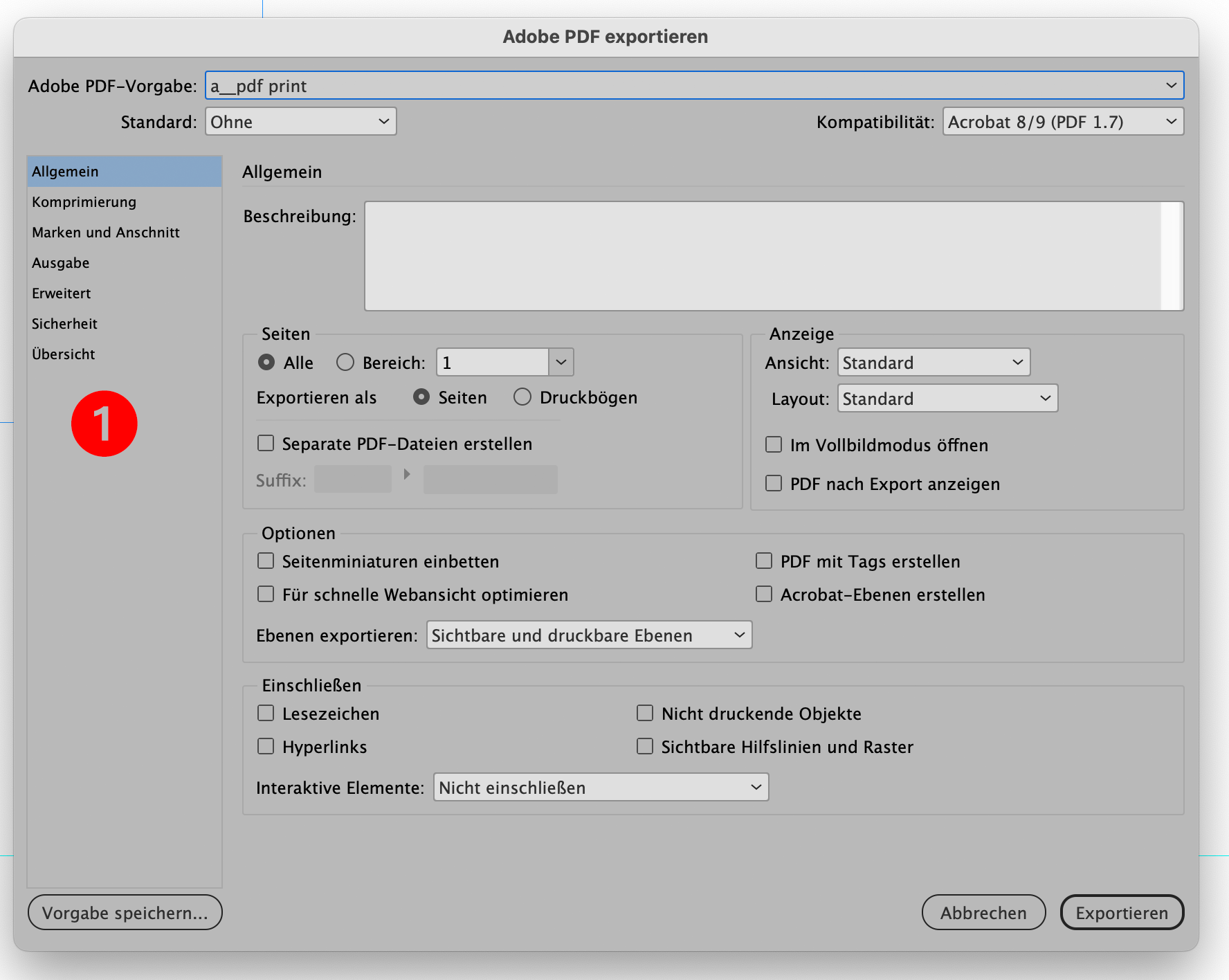
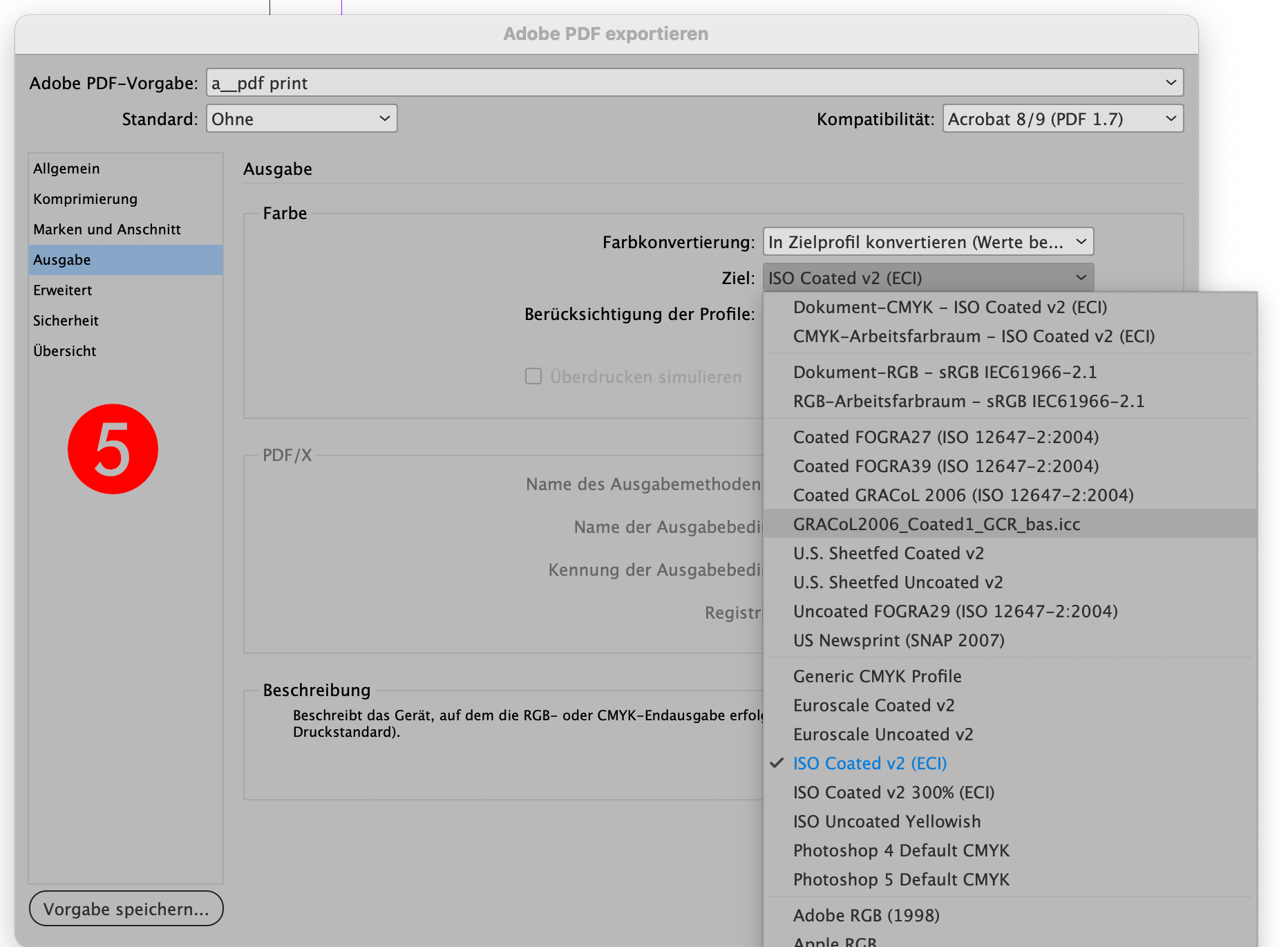
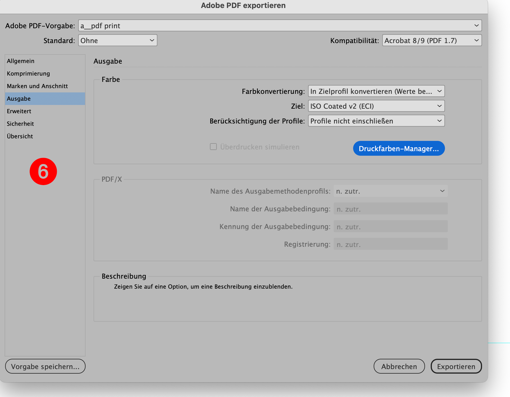
Go to the menu -> File-> PDF Export and select -> New.
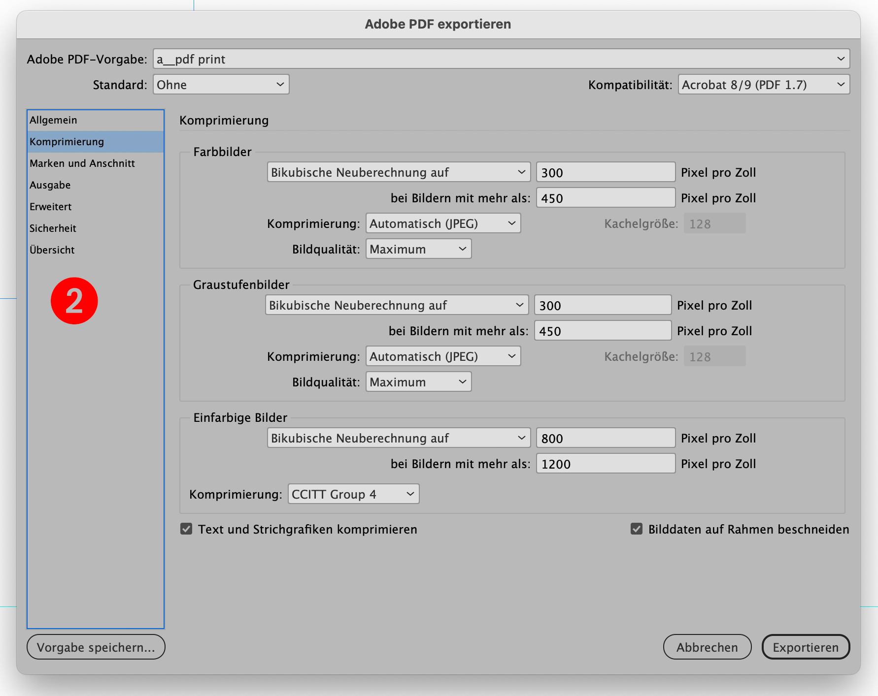
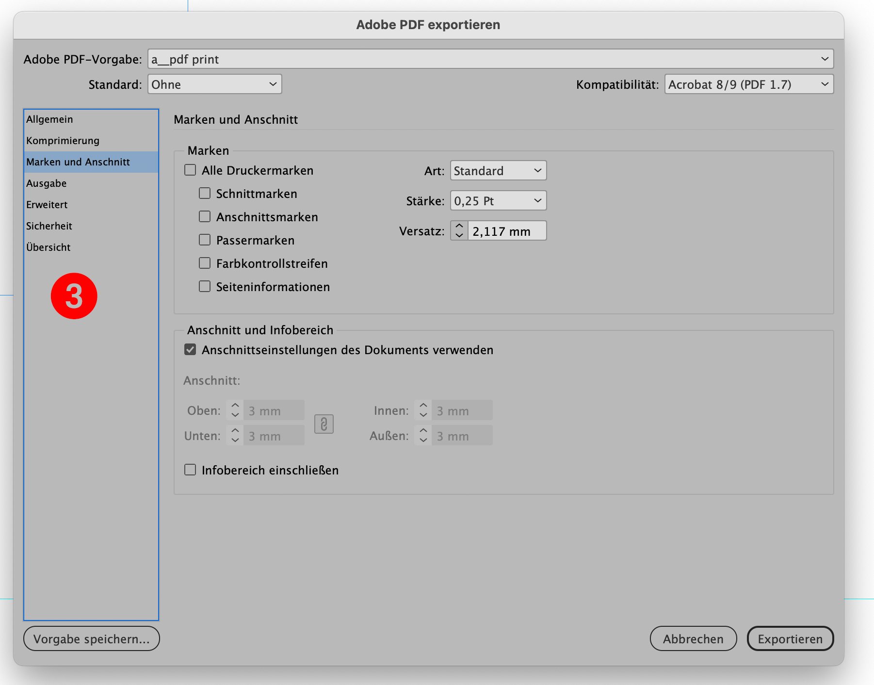
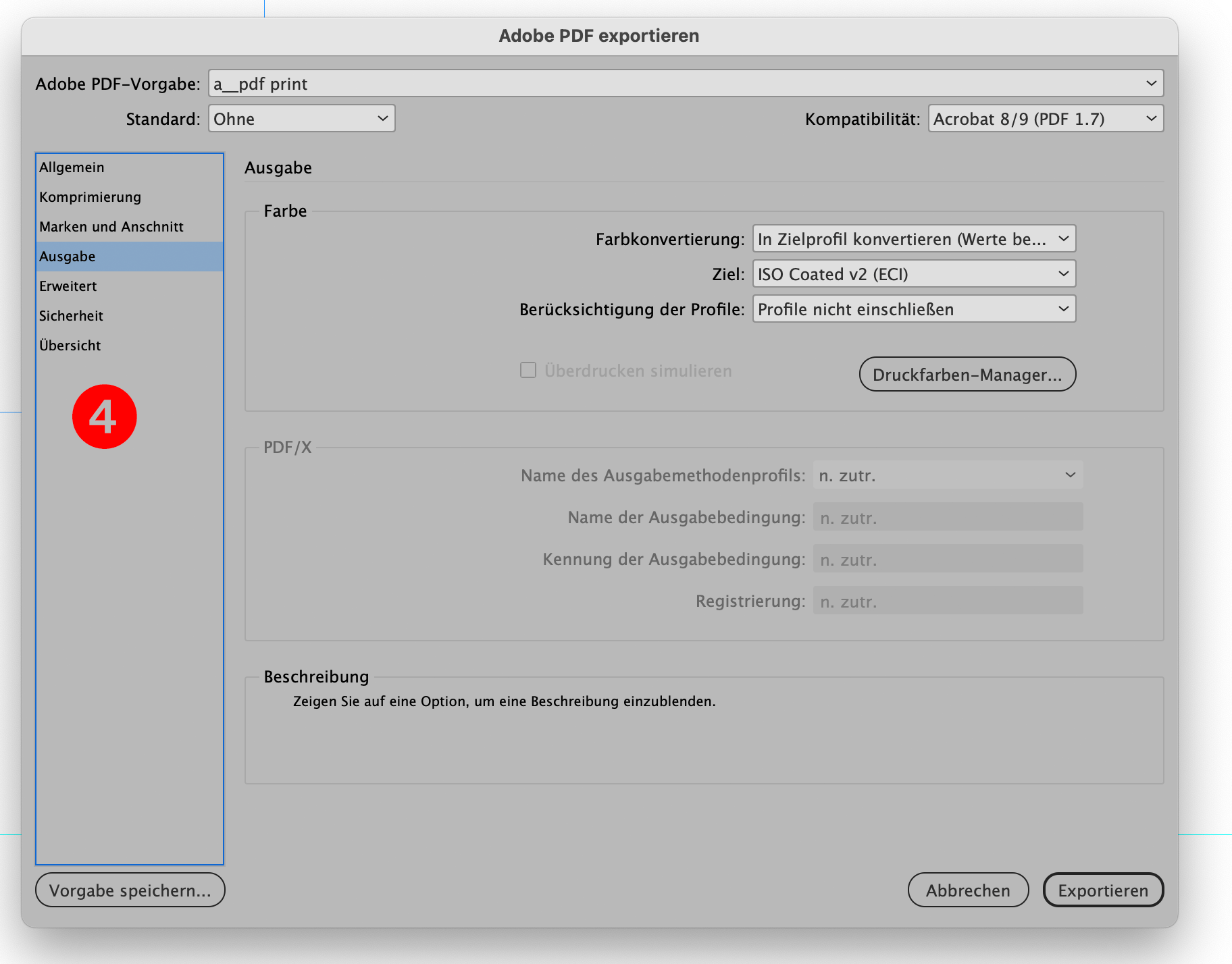
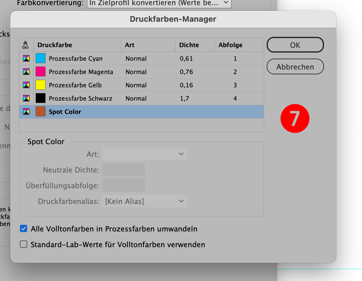
Adjust the settings as shown in pictures 1 to 5 (below).
Save your settings and use them when you output for offset printing.
There is a drop down box on image 5 - you should use the output profile that suits your needs. Normally this can be ECI, FOGRA or the highlighted [corrected 2023-1122] Gracol Coated. An explanation follows later.
You are now off to a good start in producing professional PDFs for offset printing.
You can duplicate this setting and change the settings from 300 ppi to 180, 130 or 110 ppi as shown in Figure 2. This could then be used as a kind of proof PDF with a smaller size. The images will be a bit grainy, but perfect for proofing or layout PDFs. The lower the ppi, the coarser the images and the smaller the PDF.
Mac Conin
Founder & Lead DesignerSince 1986 in business as graphic designer, first analog, then digital with GEM, Ventura and all this old stuff.